Materials & Methods: Interview Series
An interview series with regional practitioners expanding on the materials and methods used by the artist Chryssa.
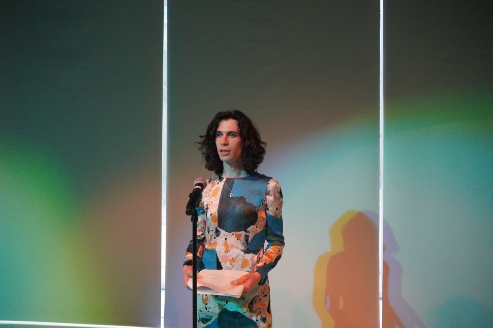
Photo of a poetry reading with Noa Micaela Fields. Photo by Moyo Abiona.
Meditations on the Letter E:
An Interview with Noa Micaela Fields
Can you introduce yourself and tell us a little bit about your writing journey, and your poetry practice?
NF: I’m Noa Micaela Fields, I am a poet with hearing aids. Being hard of hearing, I am interested in the queer potentiality of mishearing to form a different relationship with the world. As an example, for a long time I thought that Rihanna’s anthem went: “We found love in a whole new place,” instead of a “hopeless place.” Change a word and suddenly it’s worldmaking. I find those transformations to be generative, and also tangibly connected with transness.
As a poet, what was your impression of Chryssa’s prints, paintings, and sculptures, which take letterforms and language as their subject?
NF: I was struck by Chryssa’s approximately alphabetic work in neon sculpture. I liked how Chryssa worked with words or letters not just as portals to meaning, but also as signs that could be garbled, or even almost figurative. That made me think of asemic poetry, like Renee Gladman or Steffani Jemison, whose hybrid-genre practices seek out something between writing and art. Asemic poetry veers away from legibility as its communicative intent, writing with abstract gestures instead of words.
You’ve written about the potential of “mishearing” as one of your poetic interests. This reminded me of Chryssa’s interest in the openness of fragments. Chryssa is quoted as saying “I have always felt that when things are spelled out, they mean less, and when fragmented, they mean more.” Do you perceive a kinship between auditory mishearing and the visual misreading/misordering of letters Chryssa achieves?
NF: I do. Fragments are like little worlds unto themselves. They f**k around with form in the sense that they don’t need to have a clear beginning, middle, end. Despite that lack of narrative structure, the fragment has a logic of its own that holds up as a moment. Consider Sappho’s lyrics, which have survived antiquity incompletely yet still flower resonantly in their remainder, even if all we have is a phrase or line.
Listening and reading are hard to untangle in poetry since a script may be either performed or read; how do you think your poetry changes when performed versus read silently to oneself?
NF: Poetry moves through the air. That’s what the form is meant to do. There’s a musicality to poetry which can be playful and inviting because it has a sense of rhythm and momentum, even when experienced on the page. I do think that hearing a poet read her own poem can make it feel charged in a different way. But no one reading is definitive—poems change over time. Every time I read a poem, something else stands out to me. I hear a different aspect of it, which might guide me toward further revision as the poem becomes itself.
Recently I’ve been getting invited to perform in sound art shows, which is a different context for my work. So instead of reading my poems, I’ll try to create a different performance experience building on my mishearing: by writing and projecting live captions of the space, including all glitches and mistakes. Access work is also creative work, even (or maybe especially?) when it “fails.” In any case, I relish upending expectations of what a reading or performance might look and sound like.
Your soon to be released book titled E takes the poet Louis Zukofsky’s “A” as its point of departure; Chryssa also had a special interest in the letter “A”, which she called the “shape of arrows, of flying birds, the beginning of things.” Chryssa was an immigrant to New York, while Zukofsky was the son of immigrants. Both Chryssa and Zukofsky loved Bach, and worked in NYC concurrently. Did seeing Chryssa’s prints, paintings, and sculptures call to mind Zukofsky’s poetry?
NF: It’s a fascinating coincidence that the letter “A” also called out to Chryssa. “A” was the title of Louis Zukofsky’s life’s work, a layered poem composed over the course of four decades published serially in 24 fragments. I think for him, “A” first and foremost was the musical note, the tuning pitch of the orchestra. “A” also kicks off the alphabet, the building block of the English language. Chryssa and Zukofsky, who was the son of immigrants, each approached American letters and speech from an outside perspective that could never take communication for granted.
Can you tell us a little bit about your forthcoming book project E? What has the letter “E” meant to you over time?
NF: My book project E mishears excerpts from “A” by homophonic translation (echoes copying the sound but not the meaning of a poem, like a game of telephone—picking up a form Zukofsky uses in A). As the words keep shifting, they grow into something else entirely: a poem of my life.
The letter “E” is a multilayered symbol for me, but first and foremost stands for estrogen, since I started working on my book around the time I started hormones. Gender transition and mishearing dovetail in the metaphor of changing form.
Do you prefer lowercase “e” or capital “E” as a shape?
NF: Both are exceptional, why choose? But I love a long string of lower case eeeeeeeeeee’s. Like an ecstatic dolphin squeal.
Do you have any hunches as to why folks might develop affinities for certain letters? From where do you suppose that urge arises?
NF: Letters have a psychic life to them, especially when you invest in their additional associations, or use them as a placeholder—like how some trans people go by their initials. And vowels in particular are in everything we say, you can’t avoid them.
You write of unknowing and rehearing the world—which reminds me of a Chryssa & New York catalogue entry by Jonathan Katz on Chryssa’s queer world-unmaking through language. Katz argues Chryssa’s unbinding of language from meaning is a kind of queer world-making project. If language contextualizes our experience of the world, what do you find is produced by pulling text to its breaking point through writing/poetry?
NF: I am really drawn to experiments between genres. I do think that language is something that can become almost too familiar. It’s the most common thing, it’s how we talk to each other every day. I think it’s important that we question what feels natural. And, I think it’s really fascinating that we think and feel differently when we talk in different languages. So absolutely, language is a world-making and un-making form. And when we push language to its breaking point, that defamiliarization or estrangement can open us up to its possibilities for communicating what might otherwise feel out of reach.
Forming Lined Taxonomies:
An Interview with Aya Nakamura
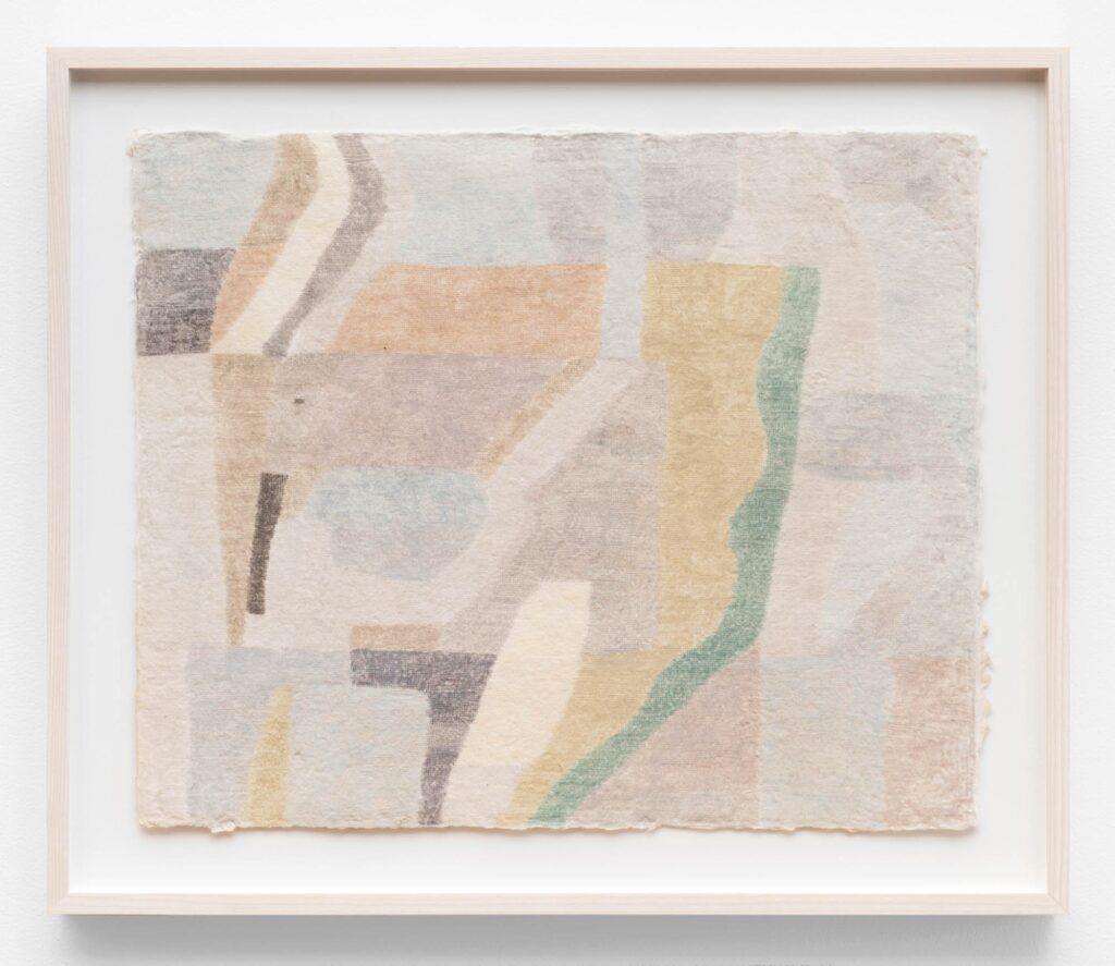
Dwelling, 16” x 19”, colored pencil on handmade paper, 2021. Photo by James Prinz.
Chicago-based artist Aya Nakamura discusses her work in relation to the structural components of language. Learn more about Aya’s work here.
You lived around the world, growing up between Japan, France, and the U.S. How has your relationship to place impacted your visual art practice?
Aya Nakamura: Growing up speaking different languages (Japanese, French, and English) has shaped my attitude towards the world and fostered multiple personalities and ways of being that are context-specific (in a way similar to code-switching). Paying attention to the relational aspect of the self, while at the same time embracing the freedom of individual expression, has played an indirect role in determining the kinds of drawings I make—diffuse, with many compositions eschewing foreground/background relationships in favor of a field, or with elements that relate specifically and idiosyncratically to one another.
Abstraction makes the relational emphasis in my work more legible and allows me to build a visual language of lines, curvy or straight, with corners rounded or sharp, and with angles and curves of varying degrees. Color is foregrounded too (that is a whole other can of worms!). I believe these elements produce different valences. At the same time, this approach is not in any way scientific—it’s more a learning by doing, and growing along the way. I think about what visuals like mine communicate—if not words (naming a specific thing in the world to be shared with others), then what? Is it meaning best made in isolation, or can it be shared, and if so, what is the quality of that sharing? I sometimes think of it as a negative or an opposite language—instead of efficiently naming or indicating the referent, it plays with it and makes it diffused. Are you this, or that? There are many ways of inhabiting something.
When describing your work, you often reference language and communication systems such as “wayfaring” and “taxonomies.” In what way is language important to your practice?
AN: A taxonomy of lines is elaborated on by the anthropologist Tim Ingold, and I have drawn upon many of the concepts outlined in his book titled Lines: A Brief History. The idea of wayfaring, for example, describes one kind of line, which is a way of moving through a territory. I liked the way Ingold described wayfaring as finding one’s way with the aid of signs, guideposts, mnemonic devices, and the like, because it paralleled the way I approached drawing. One move pointed the way to the next, and so on, so that progress was anything but linear—it was contingent and, in the moment—an interpretation of signs. This contrasted with the way Ingold described navigation, which involved mapping a path charted beforehand by assuming a bird’s eye view. For me, wayfaring was a modus operandi.
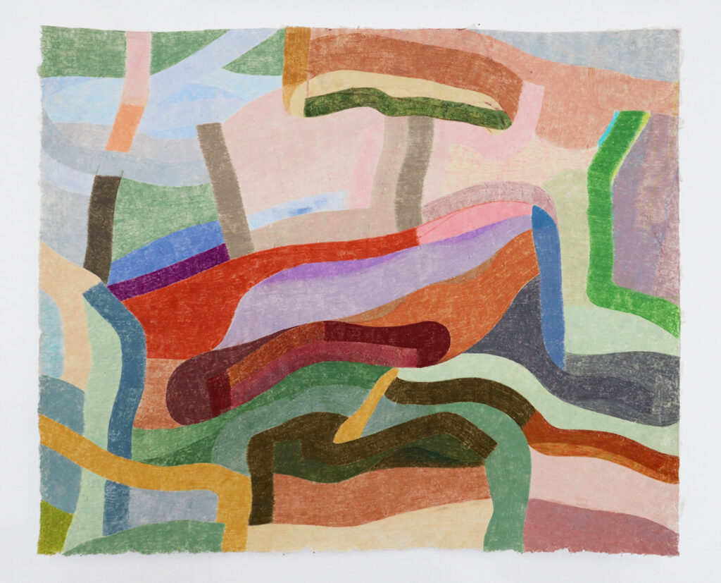
Outside Inside, 23” x 27.5”, colored pencil on handmade paper, 2021. Photo by James Prinz.
Chryssa was also captivated by components of language, stating she was “interested in letters, signs, and the structure of things.” Her fascination with the structural components of language is what allowed her, in many ways, to manipulate and abstract formal components of characters while maintaining some recognition of their essence. Can you speak a little about your own process towards abstraction and the metamorphosis of writing form into image?
AN: Every language describes a history and a world view. In Braiding Sweetgrass, Robin Wall Kimmerer describes the animacy expressed in indigenous languages like Potawatomi. By applying non-neutral (it) pronouns and verb conjugations to bodies of water, land features, animals, plants, etc., speakers of these languages do not objectify them and instead stand in reciprocal relation to them. In Japanese, the subject is not always specified, and times, places, and direct and indirect objects all precede the verb, which comes at the end. The emphasis is not on the subject acting upon the object (which is the grammatical structure of English and many other languages), but on the context or events surrounding the action and the individual. Hierarchy is also embedded into the language, with forms that honor the recipient and humble the self. Words are relatively translatable, but grammars are less so, and translations cannot capture the ineffable aspects of individual languages, creating gaps in meaning. But understanding isn’t reducible to language, either—it’s being in a place, and it’s a whole sensory experience. Language articulates aspects of this experience and shares it with others. Written language is a little different, because it has a form.
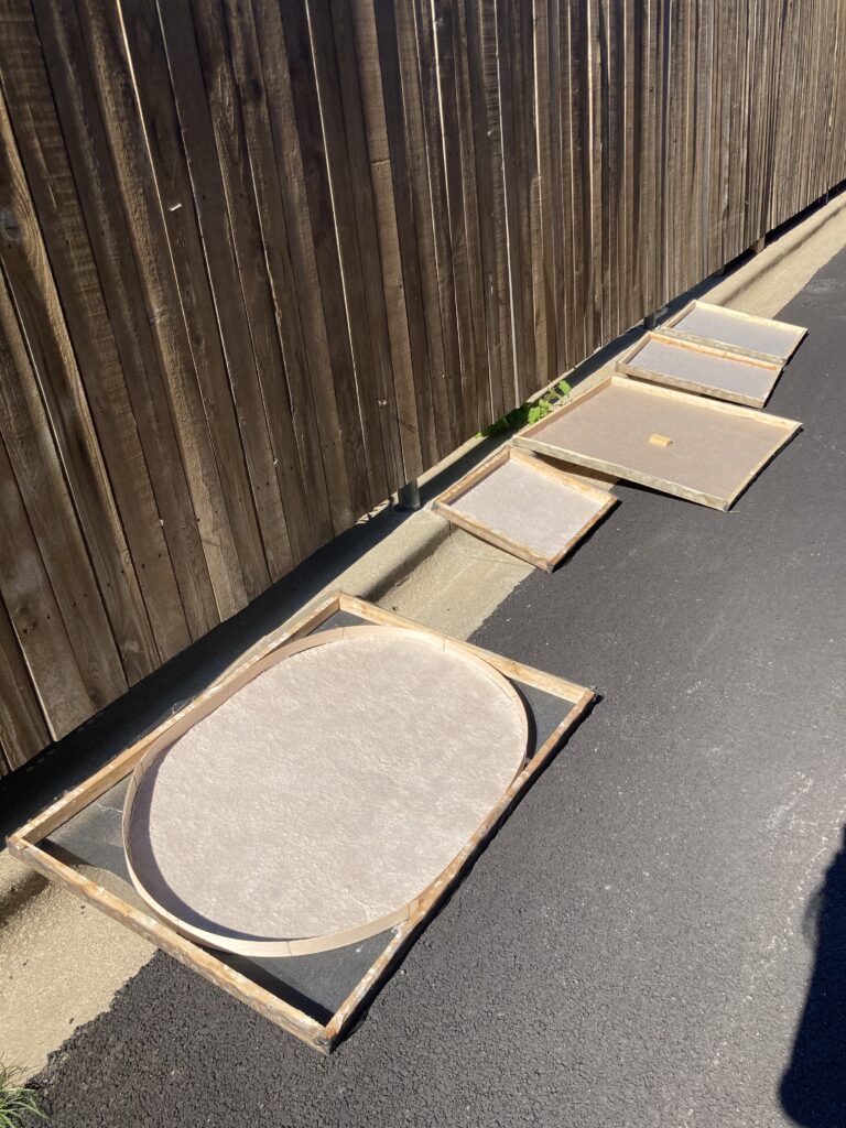
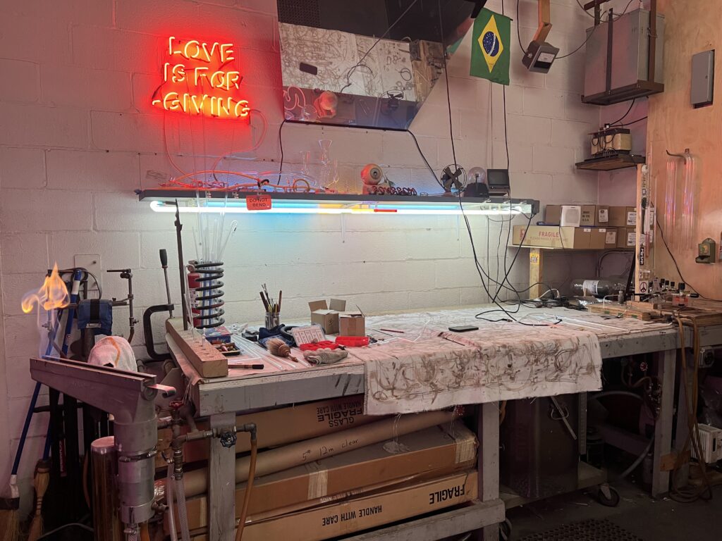
Photo of paper making.
You often incorporate paper you make by hand into your works. Can you talk about your decision to acknowledge the materiality of the page/surface? Does this choice hold any relationship to the communicative or lexical qualities of your work?
AN: I make my own paper because I want the substrate to be in relationship with the drawing. Sometimes I make the form based on a drawing I have in mind already, or sometimes the form of the paper leads first, with the drawing responding. Drawing does not exist in a void—cuneiform was carved into rock or pressed into clay. The caves at Lascaux and Chauvet reveal drawings that were sensitive to their surface, with some taking advantage of a stalactite form to describe the body of a bull. Traditional paper made in China, Korea, and Japan is made to receive ink and show it to its best advantage. Parchment paper can be scraped over and over again to wipe the surface clean of marks. I got interested in making my own paper when I realized that the kind of drawing I was doing didn’t make sense on store-bought paper, with its perfect edges and standard sizes. Drawing can be very different based on the materials that go into it, and I am still learning and experimenting on that end.
You once described your work in relationship to the process of learning to read and write and the moment when unknowable lines are suddenly, and almost magically, filled with meaning. Can you talk a little about your relationship to legibility and the balance between the known and unknown in your work?
AN: I drew before learning to write, but writing is really what made me want to draw and taught me discipline. Art classes at school were more about taking a break from learning, but writing when I was growing up in a French public school was done by practicing cursive with a fountain pen. We spent hours writing out lines of beautiful words and sentences, and I loved the magical combination of form with sound and meaning. In my hands, the visual sometimes took precedence and even dragged meaning behind it—I loved making up words and imagining what they could mean based on the way they appeared on the page. Were they a type of cloud or an enemy? Very rarely were these words ever vocalized—I doubt they were even pronounceable. But the idea that meaning could wed itself to form, even to the abstract form of Roman letters, opened a window in my head.
Japanese was different from French. The way I learned my first Chinese characters was by understanding that they were pictograms derived from forms in nature. The character for mountain looked like a mountain. There were some that were a stretch—did the character for father really look like a father, aside from the fact that it had two legs? This system felt more solid or justified to me back then, and it had a clearer link to drawing (the practice paper consists of a grid, with each square divided into quadrants so the writer can pay attention to the quality of a curve, the proportions of the overall form, etc.). I was inspired to interpret the world in lines based on this approach—this system was made for questioning. Could a river be interpreted in another way? Could a hat be put on a person to designate their job? Eventually the characters I was learning multiplied to a point where they receded in visual meaning and became just another writing system, but those early memories and feelings have stayed with me ever since.
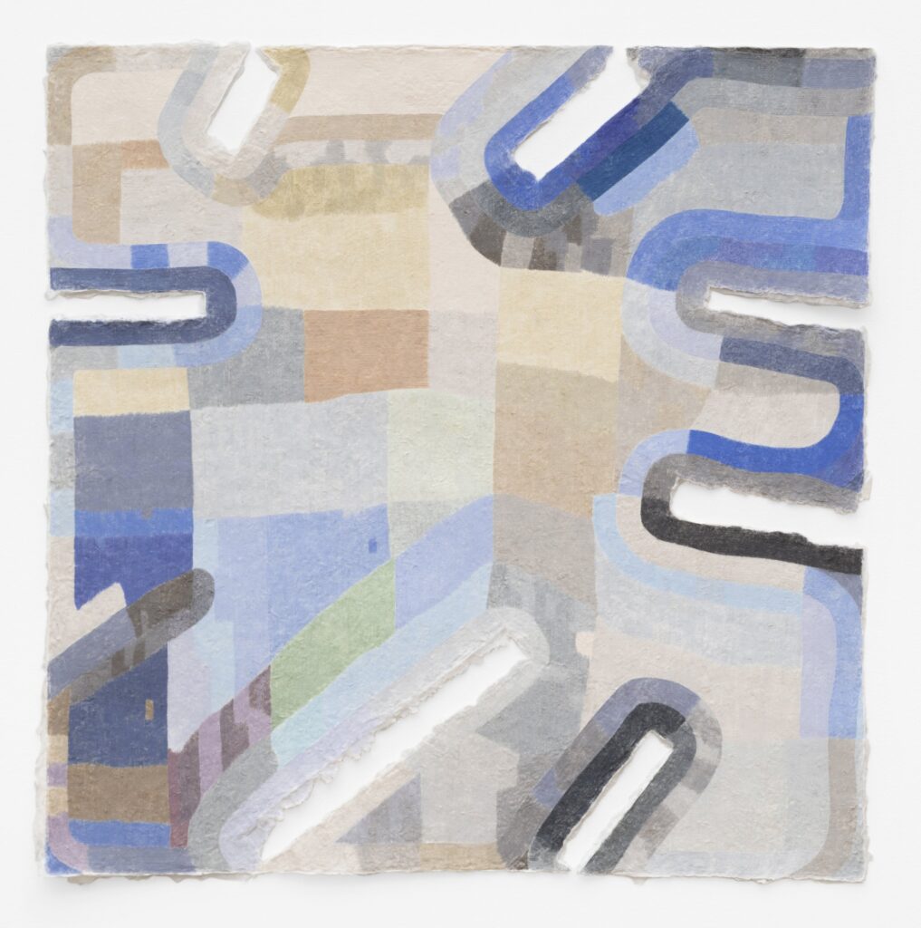
Making Shapes, 31” x 31”, colored pencil on handmade paper, 2023. Photo by Aya Nakamura.
Is there anything else you would like to mention? Any upcoming projects you are excited about?
I have a show coming up at the gallery Western Exhibitions in September. The focus of this new group of drawings revolves around vision in meditation. I became aware of the quality of my vision during my daily meditation practice, and this awareness has led me to reflect more broadly on it—on its variable and contingent aspect, its relationship to inner visions and dreams.
Best Practices in Neon Conservation
An Interview with Taylor Healy
Taylor Healy is the Assistant Conservator of Media at the Art Institute of Chicago. She was previously a post-graduate fellow at the Smithsonian. There, she researched neon artworks and historical objects, and developed documentation and preservation strategies for the collections of the Hirshhorn Museum and Sculpture Garden and Smithsonian American Art Museum. Learn more about her practice here.
As the Assistant Conservator of Media at the Art Institute of Chicago, can you tell us about time-based media and how the work of a conservator specializing in it differs from sculpture or painting?
Taylor Healy: The boundaries of different conservation specializations get blurry dealing with modern and contemporary artworks when artists’ practices and materials challenge traditional notions of artwork. Generally, time-based media conservation is concerned with preserving the significant work-defining behaviors of artworks that have durational elements. In many cases, the behaviors are achieved through technology and equipment. Time-based media conservation requires a different framework because the preservation of original materials is not prioritized over their behavior. While conservators specializing in painting, objects, paper, photography, and books are also managing the changes affecting artworks and historical objects, the artworks aren’t considered time-based because they don’t have inherent behaviors or durational qualities.
I’m generalizing, but deterioration to a painting or sculpture occurs when its environment is not compatible with the materials it is made from: Light and UV will cause light- and UV-sensitive materials to deteriorate; an unregulated environment will cause a glass sculpture to shatter. Deterioration of a time-based media artwork can be due to circumstances and environments external to the artwork and its tangible components. For example, when the last VHS tape deck ceases to function and the last VHS repairman is gone, then an artwork on VHS can no longer exist because of its dependencies on the equipment even though the VHS’s original plastic cassette and magnetic tape may be fully intact and stable. Time-based media conservators are trained to identify dependencies, evaluate their risks for deterioration or obsolescence, and prevent situations where the artwork cannot be exhibited. So, in the case of the last VHS tape surviving the last functional tape deck, we should hope that the tape was transferred to a digital file.
How did you gravitate toward a specialization in time-based media conservation?
TH: During my graduate studies, I was excited about the developing specialization and the breadth of questions about how to address artworks with complex dependencies.
My initial interest in modern and contemporary object conservation, coupled with a background in 3D modeling, signified to my graduate school advisors that I was tech-savvy. This, in fact, was not true! And over time, the most exciting thing about time-based media is that you do not need to be an expert in technology. I feel like I have become an art-electrician—something that does not remotely resemble being an actual electrician because artists are not using technology in standard and expected ways because that wouldn’t be art!
What was your first encounter with Chryssa’s work and what were your first impressions?
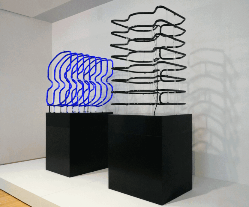
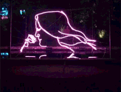
TH: My first encounter with Chryssa was in graduate school for art conservation. I was testing an analytical technique I developed to identify the gas fills in neon artworks. Spoiler: neon is a misnomer, and most “neon” does not contain neon gas. The Guggenheim allowed me to test this technique on their collection, including Chryssa’s Construction Study for That’s All, 1969-1970. There were three neon units mounted on a painted canvas through glass tube housings and pencil marks resembling neon patterns. I wouldn’t work with her sculptures again until many years later.
Let me set the scene: It is Fall 2021 at the Hirshhorn Museum and Sculpture Garden, the Smithsonian’s modern and contemporary museum branch. The museum has gone through several openings and closings due to COVID-19 restrictions, providing a unique opportunity to pursue research on collection items as the museum’s exhibition schedule paused. I had just started my research exploring the care of neon artworks and historical objects when the Dia Foundation requested Study for The Gates and Clytemnestra, which were coincidentally both in the Hirshhorn’s collection. This loan request would trigger my first encounter with Chryssa and her two remaining black-light sculptures. I loved how she was inspired by the formal qualities of neon advertisements in New York. My own sculpture practice grew out of a similar appreciation for signage and inadvertent sculptural forms that signage can take when it is in a state of disrepair. As a conservator who does not have a very active artistic practice, I am inspired by artists who make the sculptures I wish I made, and my career allows me to make those sculptures accessible to others in the future.
In your experience as a conservator, what would you say is A) the greatest challenge of Chryssa’s neon works, and B) the most interesting or fun component to work on?
TH: The greatest challenge is keeping the lights on (pun intended). Chryssa was very aware of their dependencies and was vocal about navigating a future in which they could not be illuminated. She has stated in interviews and lectures that her sculptures can be displayed without illumination if transformers cannot be sourced or if replacements cannot be created.
The most interesting and fun part of preparing Chyssa’s sculptures for this exhibition has been working with extremely talented neon benders and artists. I have met some of the most brilliant and passionate characters as a result of this exhibition, and have learned about the wide range of strategies that have been employed to keep the lights on.
Prior to your current role at the Art Institute, you were involved in the conservation research and restoration of two sculptures included in the Chryssa & New York exhibition, Study for the Gates #14 (Clytemnestra) and Study for the Gates #15 (“a flock of morning birds”), undertaken by the Hirshhorn Museum and Sculpture Garden. What can you tell me about the initial state they were in at the beginning of the project, and what the process of repairing them entailed?
TH: All technology-based components of artwork have a limited lifetime and will require replacement and/or repair, and neon is no exception. My supervisor and I went into this project with the understanding that preservation relied on replication of the neon units. I admit that I was extremely naive at the beginning of my neon research in thinking that by analyzing the gas and glass composition of the neon units, exhibition copies and preservation backups could simply be fabricated.
I was tasked with assessing the components and deciding if they could travel to three venues in the United States with the guidance of my supervisor, Briana Feston-Brunet, Variable Media Conservator at the Hirshhorn. The two neon sculptures were made of hand-bent black glass tubes that, when illuminated, would produce a deep violet glow that escaped into the non-visible ultraviolet region of the electromagnetic spectrum. Think of tanning bed blacklights but bent into Chyrssa’s iconic bird and ‘S’ shapes. Both sculptures were extremely fragile, and one had already suffered a catastrophic break, rendering it unexhibitable. At that point, we determined that the original neon units could be loaned, but exhibition copies could be fabricated and installed with their original bases. Just identify the materials and create faithful copies. Easy, right?
It would take ten months of international calls with manufacturers, fabricators, and hoarders to realize how naive that was. While the glass composition could be confirmed through instrumental analysis and manufacture documentation, sourcing those materials was dependent on evolving global supply chains, environmental factors and regulations, geo-political relations, and an industrial drive for efficient lighting technology in the last century. It turned out that blacklight neon and fluorescent tubes were replaced by incandescent and LEDs and that non-industrial runs of the glass had ceased in the 80s. In this case, analysis of gas and glass composition proved useless if replacement materials themselves were obsolete. I exhausted options such as ordering $1 million batches of blacklight glass from South Asian factories, to creating scale models of the sculpture with smaller blacklight tubes. One fortuitous call to a Venetian glass manufacturer resulted in a small (600kg) batch of glass that would be the first to enter a crucible in decades that would be pulled into the exact tubes that the sculptures required. Because of the time difference between Washington, D.C. and Italy, I went to sleep just after I received a text that the black glass was entering the furnace, and I dreamt about approving the loan to the Dia Foundation. By the time I woke up the next morning, I read the disappointing texts from the factory (translated from Italian): “catastrophic failure, won’t attempt again.”
Devastated that our one shot failed, I lamented over happy hour with a fellow conservation colleague. She mentioned the name of a hometown friend, who had made a business out of scavenging abandoned Soviet warehouses for light fixtures and bulbs. If anyone could find the deadstock blacklight glass, it would be him. With the loan approval deadline rapidly approaching, I received a call that he could pull just enough blacklight tubes off an assembly line in China to create four sets of exhibition copies. However, an added challenge was finding a neon-bender who had the skill set to bend this uncommon material into Chryssa’s impressive shapes. After many more phone calls, we selected matteline dilling and Zach Velkoff at LiteBrite Neon Studio in Kingston, New York, who successfully bent replacement neon units using patterns taken from the original sculpture. They were crated and sent to the first venue, Dia Chelsea, weeks before the opening. Restoring these sculptures is one of my proudest conservation accomplishments to date and seeing them here at Wrightwood 659 is amazing.
Through your experience researching and working with Chryssa’s neon sculptures, is there anything about her practice or methods of art making that you wish more people knew?
TH: I want people to know that Chryssa was far ahead of her time! She extracted the medium from its sign vernacular and truly tested the limits of the glass, gas, and electronic components. I also want people to know about how her practice was at odds with the patriarchal art world and neon sign industry, yet she was able to create these fabulous artworks. There is this ongoing debate about whether she actually bent neon herself, but it is well documented that she was not allowed to get in the fires because she was not part of the neon sign makers’ union in New York. Critics and even collectors contemporary with Chryssa wrote about her with misogynistic undertones, calling her ‘mercurial’ and difficult to work with– terms that continue to define women in the arts. I think art historian Sam Hunter used ‘mercurial’ to describe her unpredictable nature, but perhaps we [should] use it to describe her artworks that actually contain mercury! If one wants to know about Chryssa, I suggest reading her 1966 interview “There’s Only So Much You Can Put on a Hotdog.” She is an endlessly fascinating person and has been the main topic for neon conservation. The Menil Collection hosted a symposium where art conservators, historians, and neon artists spent two days discussing Chryssa.
I also want people to know that the preservation of Chryssa’s neon sculptures—and all neon—relies on the preservation of the craft and the people with those skills. In order for future generations to become exposed to Chryssa, institutional collectors and private collectors will need to support neon benders. This may be a controversial opinion, but I don’t think any artwork is more important than the wellbeing of people. I would urge my colleagues dealing with neon specifically, to learn about the risks to the environment and people associated in its creation and preservation, and evaluate whether those are worth compromising for the sake of preserving art. A notable example would be to avoid performing what is called a “mercury repair,” that will retain the original bent glass and refill it with argon and mercury. This puts the bender at risk for exposure to elemental mercury and though it can be done with extreme caution, mercury exposure over time has severe health consequences. I think we can be smarter about our choices for preserving artworks.
How has the research you undertook in the conservation of Chryssa’s sculptures informed your methods and practice on other objects afterward?
TH: Brilliant research and collaborations have come out of this exhibition due to the complex nature of Chryssa’s neon sculptures. From the Hirshhorn’s Chryssa sculptures, I developed a neon documentation template to assist my collections care colleagues in condition-assessing and documenting a range of neon artworks.
I recently co-hosted a workshop on the care of neon artworks at AIC which distilled much of the research I have done, and my colleagues’ experience with installing the traveling Chryssa exhibition with conservators, curators, and other collections professionals. I am overjoyed with its success: at 9 am, workshop attendees voiced their fears about working with the seemingly fragile glass tubes and high voltage power sources. By 3 pm, everyone was fully confident in handling and assessing their needs.
I am working with Ellen Moody at the Getty Conservation Institute to publish neon care guidelines for conservators. We feel it is important that the guidelines are informed not just by research but through discussion with the real experts: neon benders and artists. One of my greatest oversights was to advocate for stockpiling the necessary equipment and materials (a common time-based media practice). I later realized that the equipment may be rare and vital for their own practices, and I took that from the community that I have been charged with advocating for and relying on their expertise to do my own work. This ongoing collaboration has inspired me to take neon-bending courses at the School of the Art Institute, where I can finally learn how to make neon units and perhaps restore existing ones.
Molding Metal
An Interview with Gwen Yen Chiu
Gwen Yen Chiu’s metal fabrication studio, 2021.
Chicago-based sculptor Gwen Yen Chiu discusses the impact of language, heritage, and motion in her monumental metal works. Learn more about her practice here.
Could you share some details about your background and how you started making metal works and ink paintings?
Gwen Yen Chiu: I can trace my relationship to art back to the calligraphy classes I took with my mom. I was born and raised in Michigan, and for my immigrant mother, calligraphy was one way we could remain connected to our heritage. In addition to Chinese calligraphy and painting, I was also taught three languages. Growing up, I always wanted to follow the art path. I went to the Rhode Island School of Design (RISD) right out of high school, then transferred to the School of the Art Institute of Chicago (SAIC) in 2010. I took a metals casting class and fell in love with the material for its historical and formal properties.
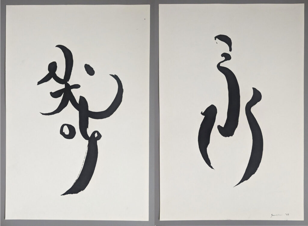
Gwen Yen Chiu, “Calligraphic Interpretation No.2,” 2024, ink on paper.
Gwen Yen Chiu, “Calligraphic Interpretation,” 2024, ink on paper.
You have credited practicing Chinese calligraphy with your mother as a sculptural influence; the flourishes within your metalworks invoke flicks of the wrist. How do you retain this sense of spontaneity in what are ultimately highly considered and complex forms?
GYC: Chinese calligraphy is still ingrained in practice—from drawing to metalwork. I start with a brush and rice paper and then translate the ink marks into cut patterns, which become three-dimensional metal forms. I attempt to follow the initial ink marks, however, metal moves a little differently than a brush. I try not to control the materials and keep an open mind to their spontaneity. This approach also stems from Chinese painting. Unlike oil or acrylic painting, you make one mark, and that’s the mark you get—you can’t erase it or go over it. There is a sense of letting go—this is a part of my metal and calligraphy work.
So you use the structure and philosophy of calligraphy and Chinese painting to generate sculptural forms?
GYC: Yes, I would agree with that. I also had a very good mentor—I worked as a studio assistant for Richard Hunt for five years. He was brilliant and rigorous in his work but also responded intuitively to the material qualities of metal. I learned a lot from him. This is when I really began to experience how metal can be a spontaneous material instead of rigid. I think it all plays together and connects back to Chinese calligraphy.
Chryssa had affinities for certain letters. She liked “A,” for instance, heralding the letter as “the shape of arrows, of flying birds, the beginning of things.” Are there any characters or gestures you return to in your practice year after year?
GYC: I do return to specific shapes, and I loved reading about Chryssa’s affinity for light and certain alphabetical letters; I definitely felt a connection. When I first started doing metal work, I was interested in capturing ephemeral things like smoke, upward flight, and contrails—things that were in our everyday environment but were temporary. For example, I often return to the Chinese character for flight because it’s a beautiful form which actually looks like birds are flying. You can really play with the flicks, the brushstrokes, and the gestures. I have an attachment to the flight character, and it repeats itself throughout my compositions.
Chryssa was also interested in the flight of birds. Her sculpture installed at 33 West Monroe here in Chicago pulsed on and off, mimicking the bird’s ascension.
GYC: I enjoyed reading her lecture from 1968, which read like a manifesto. She wrote about how a sculpture’s technological and kinetic elements shouldn’t determine its value. In other words, the work doesn’t need to be moving or even turned on to be beautiful. It is poetic in a way, considering [Chryssa’s SOM sculpture] does not flicker anymore. But I know how important time and timing was in her work.
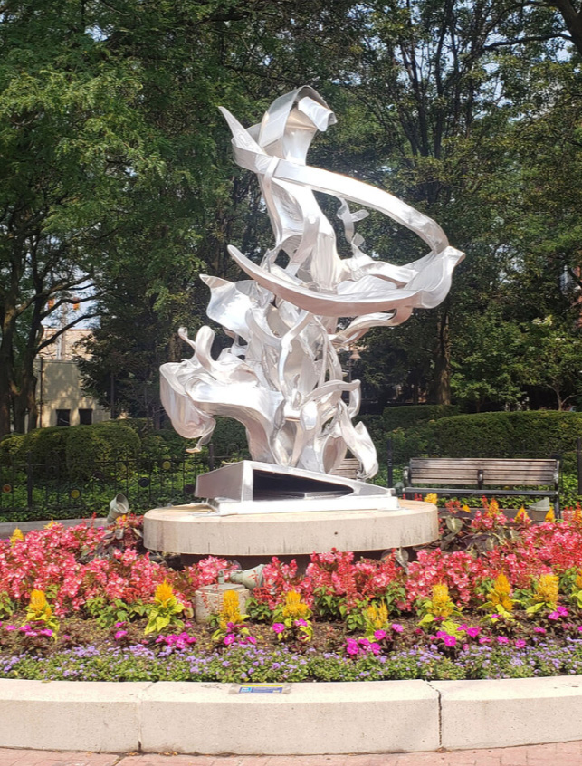
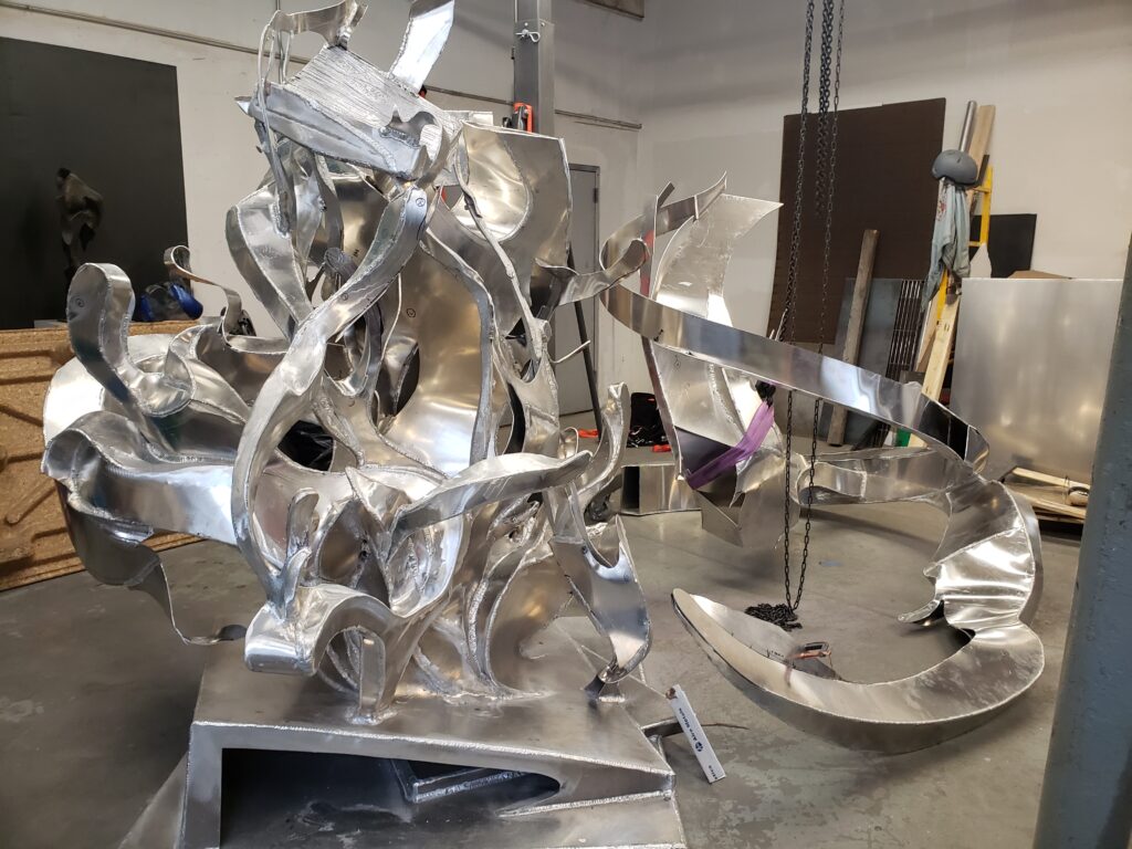
Gwen Yen Chiu, “Thought Vortex,” 2021, cast and fabricated aluminum, 11.7′ x 8′ x 8.5.’
Your 12-foot public sculpture, Thought Vortex, was installed at the intersection of Lincoln Avenue and Halsted Street in Chicago in 2021. Chryssa also created several public works which interacted with the urban environment. How did you view Thought Vortex in relation to its immediate surroundings and the broader context of Chicago?
GYC: I believe public sculpture should be accessible. Take, for example, Claes Oldenburg’s 1977 Batcolumn, which is about 100 feet tall and very narrow. For me, the sculpture is difficult to engage with, since the top is not visible and it lacks immersive qualities. Public sculptures, in my view, should envelop the public like a big hug. If viewers cannot connect with a sculpture’s presence, it diminishes the purpose of placing it in a public space. In Thought Vortex, I designed wind formations coming out of the form, making it appear broader than it actually is. Ultimately, I think it’s a matter of, in Chryssa’s words, letting the sculpture breathe: it’s not about positive or negative space but [about] allowing the viewer to feel the presence of the piece.
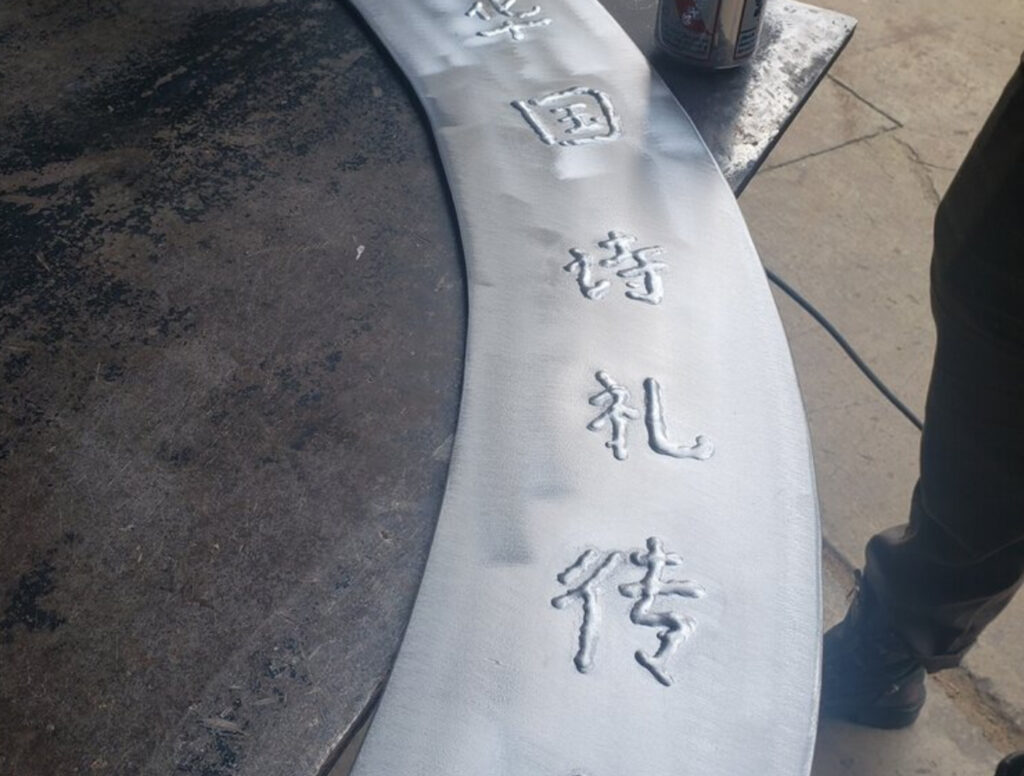
Thought Vortex was installed in 2021 and, as I recall, passages of Chinese characters were inscribed, weld-by-weld, onto the sculpture’s compound curves—the effect was dazzling. Can you talk a little bit about the inspiration for the piece?
GYC: Thought Vortex was designed at the start of the pandemic when Asian hate crimes were escalating and getting out of hand. It was a time when many members of Asian American communities feared going outside. Not only was I stuck in my house, but I also wanted to think about making an ode to those feelings.
The sculpture includes an abstracted Ming dynasty chair—referencing the era when my ancestors immigrated from China to Taiwan in the 1400s. I wanted that chair amidst this kind of vortex of these dreams of going elsewhere; this is where the piece started. The inscription has been passed down in the Chiu family. You know how European families have a coat of arms? Chinese families have the written language as something that is passed down—like a saying that is passed down. The quote reads something to the effect of “literature and the written word will flourish in your home (country). Poetry and elegance will flow through this family.” I thought that this passage was appropriate almost like a signature—it was my signature—I didn’t sign this piece. There was also an escapist quality, the passage gave me the feeling of connection when I felt isolated during the pandemic. It was kind of nice to make that piece as an ode not only to the community around Chicago, the Asian community, but also an ode to my family.
Gwen Yen Chiu, “Thought Vortex” (detail), 2021, cast and fabricated aluminum, 11.7′ x 8′ x 8.5.’
That’s an interesting family history of migration. Your family remained in Taiwan from the 1400s onward?
GYC: Yes! Then my parents immigrated to the United States in the 1980’s, and then I was born here.
Do you see the gesture of material translation, from ink into aluminum, related to linguistic translation?
GYC: YES, I do! As a child of an immigrant, I learned three different languages simultaneously, but I was not allowed to speak English at home. It was a weird yet abstract way of learning language—close to a native tongue, but not in the physical country. Now, when I go to Taiwan, China or Japan, I can communicate, but the locals can tell I’m not from there—not necessarily because of my accent, but my gestures and the way I use certain words are different.
It has been really fun transforming written characters into abstract sculptures. By deconstructing their two-dimensional forms and original shapes, I create pieces hinting at the characters’ influence, which you can only really see if you are familiar with the language.
Do you see a connection between the monumentality of sculptural forms and the monumentality of language?
GYC: I do, but I think the monumentality of language is much larger. I don’t know if it is possible to truly evoke the monumentality of language through sculpture. For example, if we are talking about a permanent, site-based sculpture standing on its own, the physical form can only fill so much space—whereas language has become something much more expansive. I think art and language have a similar effect in this way—because art is a language. When it comes to everyday linguistic communication, I think the possibilities are endless in comparison to what can be accomplished through a sculptural monument…I might get some haters for saying that (*laughs*).
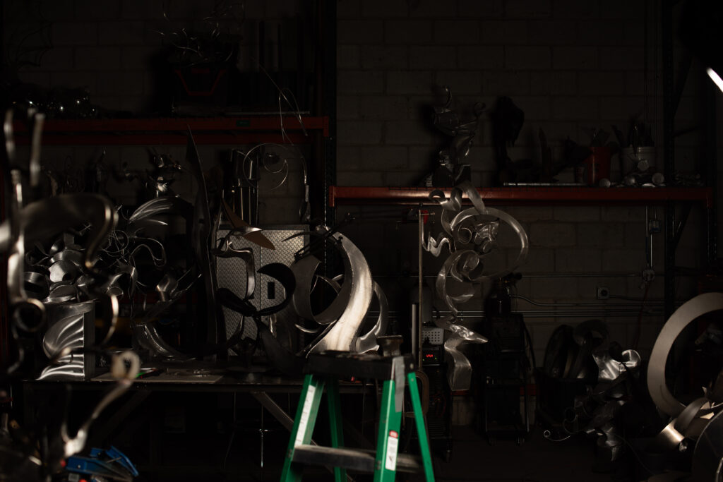
Gwen Yen Chiu’s metal fabrication studio, 2021.
Do you also think about “monument” as a kind of encounter, in addition to being a size? For example, something that is physically small can feel monumental, while something that’s actually large may not feel monumental.
GYC: Well, when considering monuments in this broader context, I believe their potential is as limitless as language. They can evoke a deeper meaning beyond the limits of scale. I’ve been reflecting on Chryssa’s description of metal as being flexible as rubber during the forming and bending processes—I love that. I’m especially excited to see her Cycladic works.
Her Cycladic works are stunning! At Wrightwood 659, they are installed under a skylight so natural light streams over them. The scratches and surface imperfections on the Cycladic Books almost become a script when activated by natural light.
GYC: I like to leave imperfections in my sculptures as well. There is a fine line between a manicured sculpture and a sculpture where you can feel the presence of the person making it; it’s a different viewing experience. It can quickly become too manufactured. If that’s how your practice works, then great! But I’m a hopeless romantic, and I like the flaws; they’re very much part of my practice. Leaving grinder marks is intentional, and I’ll leave weld marks too—there’s kind of that imperfection that makes it perfect.
I’ll generally leave it when a mistake or blemish follows the ink stroke or gesture. However, if it’s obvious that I patched something together, I will remove evidence of that. I want to leave the hand; I don’t want to leave the process.
Chryssa was interested in the sculptural principle of static light—in her words “the form is static, not moving, and is…[activated] by natural light alone.” As a viewer, I feel choreographed into ambulating around your sculptures. Is light a factor in your effort to produce a sense of dynamism in otherwise still works?
GYC: My use of light is a little bit more formal. I’m more interested in capturing the form through the available light source, whereas Chryssa was thinking about light in a more multifaceted and conceptual way. If Chryssa’s focus was light, mine is motion. I consciously try to emulate blurred lines of motion, so the resulting work almost feels like it’s moving while it’s static.
I want my work to feel like it’s turning, spinning, floating, or swirling, offering viewers the impression of movement through still forms. The way light interacts with the sculptures creates a sense of three-dimensional form. I think about motion as something that disappears into space—like when you look at a contrails in the sky, and you can almost see the continuing line even though it doesn’t actually exist. Those are the kinds of moments I try to capture in my sculptures.
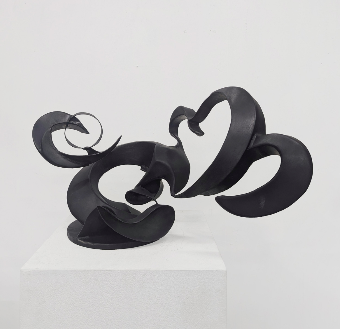
Gwen Yen Chiu, “Heart,” 2024, darkened stainless steel, 15″ x 28″ x 16.”
How do you settle on surfaces finishes? Some of your sculptures are polished, others bear concentric grinder marks, or dark patinas.
GYC: In my aluminum works, I try to capture ephemeral forms such as motion, flight, or smoke—temporary things occurring in our environment. For those sculptures, I use a grinder brush to make gestural marks to bridge form with the material. The way light captures marks in those pieces completes the work. Recently, I have been integrating my calligraphy and my sculptural works. For example, I’ll use a dark patina to emulate ink. I find the darker surface treatment ties all the different processes together. The dualities between soft/hard, rigid/light, and metal/ink find a nice balance through that finish.
Chryssa fragmented, rotated, and repeated words and letter forms. She was interested in language but not necessarily legibility. You describe taking similar liberties while writing characters hundreds of times. What do you feel is opened up in this process of abstracting familiar carriers of meaning?
GYC: Fragmentation allows me to think of the history of the characters. All the Chinese characters come from drawings of real-life things, so whether I’m considering that history, what the character actually means, or what it takes physically to make that character on paper, it’s like I’m making my own form of language as a continuation of an existing one. I’m taking a language and reinterpreting it—I think it’s a big field I’m mining, and that is exciting; the possibilities are almost endless.
Crafting Neon Signs
An Interview with John E. Bannon
What first sparked your interest in neon, and how did you begin working with the form?
JB: The University of Illinois had a neon class back in the 90s, and I enrolled in it during my last semester. The idea of creating and controlling colored light instead of relying on reflected white light (as in painting) was a concept I felt had a lot of potential.
I began incorporating neon into my work to illuminate and experiment with colored light. I was and still am interested in human perception, what we all have in common physiologically, and I try to connect to the viewer in this way. I work to create an experience rather than presenting my thoughts about an experience. I find neon, with its malleability, can be part of an interesting, illuminated composition and, at the same time, create an environment by filling a space with colored light. It can only be fully appreciated firsthand. In the neon pieces I am making today, the work focuses more on presenting time in a layered, historical sense while existing, illuminated, in the present.
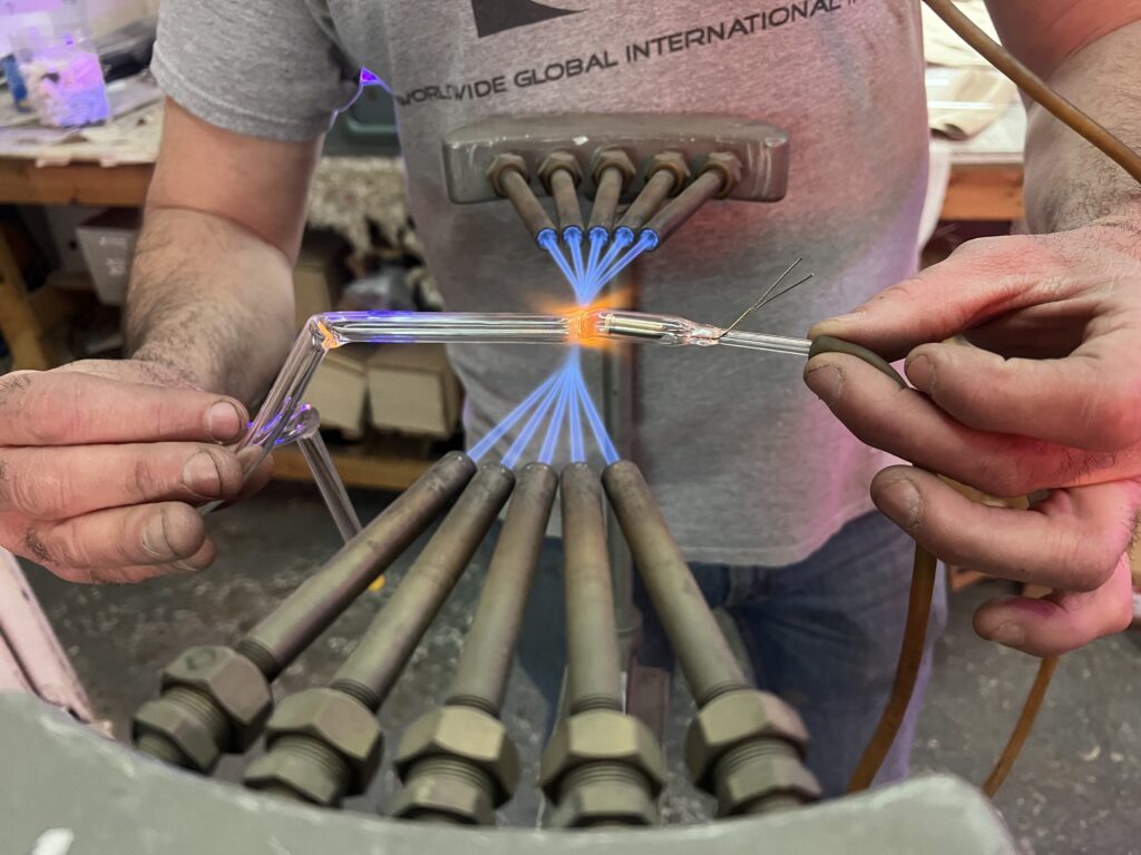
Can you describe the neon fabrication process and what steps you take to transform a drawing into a light sculpture?
JB: In the days when Chryssa was active, the drawing would most likely be enlarged onto paper using an opaque projector, then modified by hand to accommodate the tube diameter. With the drawing correctly proportioned, the technician would trace the image with a stylus over carbon paper onto the pattern material, a woven, fire-resistant fabric which will not burn when the hot glass tube is laid on it.
Today, the process typically begins with a drawing scanned into a vector-based computer program, such as Adobe Illustrator. There, I scale it to the correct size, and enlarge the lines to the diameter of the neon tube—creating a pattern for me or another bender to follow—and transfer it to the neon pattern material via a marker and digital plotter.
Next, I move the pattern to a workbench surrounded by a couple of different gas-fed torches. The neon glass arrives from the factory as straight tubes, four to five feet long in various diameters and colors. I heat the tube over a torch, and when it gets soft, I put it onto the pattern and adjust it to fit. When the glass is cool enough to hold its shape, the process is repeated for each curve until the design is complete. At some point before the end of the bending process, a pair of electrodes are welded onto the open ends of the bent tube. (A neon electrode consists of a metal cylinder encased in a short glass tube with one open end and a pair of short wires extending from an airtight, pinched-off closed-end.)
After the tube is bent and the electrodes are attached, it is ready to be filled with neon gas. The bent tube is welded to a glass manifold through an open tabulation, usually located on one of the electrodes. The manifold has a vacuum pump connected to it. The pump removes all the air, moisture, and other impurities to create a completely sterile environment inside the tube; this condition is achieved through a process of heating and evacuating the tube, known as bombarding. After a short cooling period, the vacuum stopcock is closed, and the neon stopcock is opened, filling the tube with neon gas. The tube remains under atmospheric pressure after being filled, so to remove it from the manifold, one simply heats the tabulation until it sucks in and seals itself, resulting in a tube containing pure neon gas. The whole bombarding process usually takes about half an hour to complete. For the gas to illuminate, the wires extending from the electrodes are connected to a transformer, which boosts the voltage from average household voltage (110~120) to high voltage (2K~15K).

How has your neon practice changed since you first started working in the industry?
JB: I started making neon in 1990. It takes years of practice to make uniform bends and consistent letterforms, so starting out, I was limited to primarily graphics and straight tubes to illuminate my 2D paintings (which I was most interested in anyway). After some time honing my skills, I could make text-based pieces for myself and other artists. Later, I had the idea to create two-dimensional imagery in a three-dimensional space by aligning sculptural elements in different scenes which change based on the viewer’s location. I used neon for these sculptures because the illuminated elements would be bright enough to drown out the background interference. I wasn’t aware of other artists doing this kind of work at the time. It is now referred to as a kind of anamorphic sculpture. I still think neon is the best way to produce this kind of spatial illusion; however, this type of work can be difficult to make in neon because the glass has to be bent over a three-dimensional, curved surface instead of a flat table.
Currently, I am back to 2D graphic imagery mounted on old pattern material. The pattern material is often reused and, over time, can get crowded with layers of drawings and burn marks from previous signs. I have a stockpile of these old patterns, and I find them interesting aesthetically and conceptually. The tubes I use to compose the subject matter are filled with krypton gas, which glows white and is much less intense than neon. The pattern material making up the background is full of exciting burn marks. The soft white light against the burn marks gives a subdued feeling to the work. Upon closer inspection, one can see the text and graphics representing the history of sign culture from years ago.
The advent of LED lighting has made a big change to the industry since I began. There is no longer a big advantage to using neon for illumination. LED is more compact, uses less energy, and is not nearly as fragile. I still prefer the quality of the neon light over LED, and neon can still last longer. Since the upheaval, neon has taken on a more nostalgic quality, and I see it appearing in artwork more now than ever before.
The process of making neon has stayed, essentially, the same since it first began in the early 1900s—which I find fascinating. The main improvement, from my perspective, is in the transformers which power the neon. Today, transformers are equipped with ground fault interrupt circuits which turn off the power if a tube fails, making them much safer than the transformers from 25 years ago. Also, neon power supplies now use radio frequencies to light the tubes. These are safer and much smaller than traditional transformers. This technological advance has led to the prevalence of neon in artworks. The small size makes it easier and safer for the artist to hide electronics.
What technical challenges do you face when fabricating neon, and how do these influence your creative process?
JB: Determining where the transformers and wires will be located can be challenging. One can only light up so much tubing per transformer, so I have to figure out where to end the line of tubing and where to start a new one. Where to feed the power to the tube and where to connect them to complete the circuit. This influence on the creative process involves deciding if the transformers, wiring, and other electronics will be a visible part of the piece. Sometimes, I feel the hardware should be hidden, and other times, it should be exposed. It depends on what the idea calls for.
What is always a challenge is the bending itself. There are limits to how tight one can make a bend or how perfect a circle one can make, but this is why many of us do it.
Chryssa was a pioneer of neon, transforming the signs and symbols of mass media into art. However, due to union restrictions, the outcome of many of her works was left in the hands of neon fabricators whom she was known to challenge. From your perspective as a neon worker and artist, which of Chryssa’s neon works would have been particularly difficult to produce and why?
JB: I think the most difficult pieces to translate to a union bender would have been any of her 3D works, especially USA, First Preparatory work for a Neon Box 1962. This is because neon benders are used to making 2D signs. It is difficult to figure out how the patterns would be made for this 3D piece, and I imagine she would be standing next to the bender telling them how to do it.
Could you talk about a particularly challenging project and how you resolved the difficulties you encountered?
JB: One of my earliest and most challenging projects was a perspective-based piece created in 2004, commissioned for the lobby of the CTA headquarters. I proposed a neon artwork designed to present different images from specific viewpoints. Viewed from below, it would depict the CTA rail map using colored neon tubes to represent the various lines. From the perspective of the above mezzanine, these same tubes would come together to form an image of a train departing a platform, and, when viewed from the south side facing north, it would show a scene of a bus arriving at a stop.
At the time, I was unfamiliar with 3D software, so I created drawings of the two scenes, enlarged them, and displayed them on the far walls of the studio directly opposite the primary viewing spot. The sculpture features an aluminum grid modeled after downtown bus lines, which was first fabricated and then suspended from the studio ceiling. To ensure proper alignment of the scenes, I placed rods at average eye height on the floor at specific viewing spots. I could gauge the correct placement by standing and aligning my eye with the top of a rod and drawing on the opposite wall. I then bent aluminum bars, matching the diameter of a neon tube, and hung them from the grid to align with the lines in the drawing. This process was repeated, adjusting the bars to match the second drawing from a different rod. I continued refining the alignment repeatedly until I was satisfied, keeping in mind the theoretical view of the rail map from below. I had no way to check, but it was easy to imagine. I used these three-dimensional aluminum rods (about 20 of them) as templates or patterns from which I bent the tubes. It was challenging, but it worked.
In what ways do you experiment with color and light intensity in neon? Other art forms, such as painting, have a certain directness to color mixing. How do you, for example, match colors in old neon work?
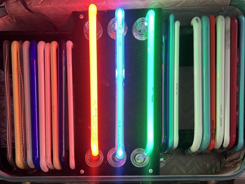
JB: In neon the way color is achieved, as summed up by a friend of mine, can be thought of as Gas Color, Glass Color, and Phosphor Color. These can be mixed and matched to produce different colors. The gases used in the neon industry are the noble gases from the periodic table, primarily neon and argon with mercury vapor, and sometimes krypton, xenon, helium.
In a clear glass tube, neon glows a bright reddish-orange, and argon glows a light purple color. When a small drop of mercury is placed in a tube, it evaporates and turns the color to a bright, pale blue. Argon is normally used in combination with mercury because it is more conductive than neon, allowing more tubing to be lit with the same size transformer. Color can also be controlled with colored glass. For example, the warm spectrum of neon in a green glass tube will appear orange, while argon with mercury will appear green in the same colored tube.
Phosphor color is another method. Different color phosphors can be used in both clear and colored glass tubes. Phosphor also makes the tubes brighter. When a blue phosphor tube is filled with neon, it glows pink. When filled with argon and mercury, it glows blue, the color the phosphor is named for. In a green phosphor tube, neon glows orange, and so on. There are many different colors and varying shades of phosphor, and one has to experiment with different color samples to see what is possible. Intensity can be controlled by the type of gas. Argon without mercury is quite dim, as is krypton. It can also be controlled with a dimmer made for neon or fluorescent lighting.
For a while, I was making a series of pieces based on landscapes showing light on the horizon. I would use a combination of different colored hidden tubes and let the light blend against the background. This resulted in an interactive piece where the viewer could produce any color by turning one dimmer up and another down.
Matching colors in old neon work can be tricky, especially when the old tube is phosphor-coated because phosphor becomes noticeably dimmer with age. In other cases, the manufacturer of the original glass may have discontinued the color or is no longer in business. Usually, one can reach out to a network of neon benders to find some rare tubes to match older pieces.
Looking forward, are there new directions or techniques in neon art you are eager to explore?
JB: I find inspiration in seeing Chryssa’s work. I wasn’t very familiar with it, having seen only one other piece of hers in person. Viewing this exhibition gives me a deeper understanding and appreciation. The neon forms resemble hieroglyphics, and I find the repetition of these forms interesting. Her work expresses the energy and glitz of New York City at the time. The fabricated found metal work and the text-like forms remind me of a large relic, but the illumination keeps it fresh and alive. Neon is in a different context now compared to when Chryssa was using it, and for producing new work, it is something to consider, but it could be a good thing.
Is there anywhere we can see your work?
JB: Transit is the neon sculpture located at CTA headquarters, 567 W. Lake St. (Jefferson and Lake). I have new pieces currently on exhibition at Ken Saunders Gallery, 2041 W. Carroll Ave., Unit C-320, Chicago. I post images of my latest work on Instagram @ban_nonart.|
Discover more of John’s work at: http://www.johnebannon.com
Join E-News
Please sign up to receive our weekly E-News, full of timely and insightful information about our exhibitions, artists, and programs.
Spring's Most Anticipated Exhibitions are on Sale
"Martin Wong: Chinatown USA"
"Dispossessions in the Americas"
"Statue of Athena" on long term view.